World War II Journal Entries Float in a Web of Blood-Red Yarn in Chiharu Shiota’s ‘Diary’
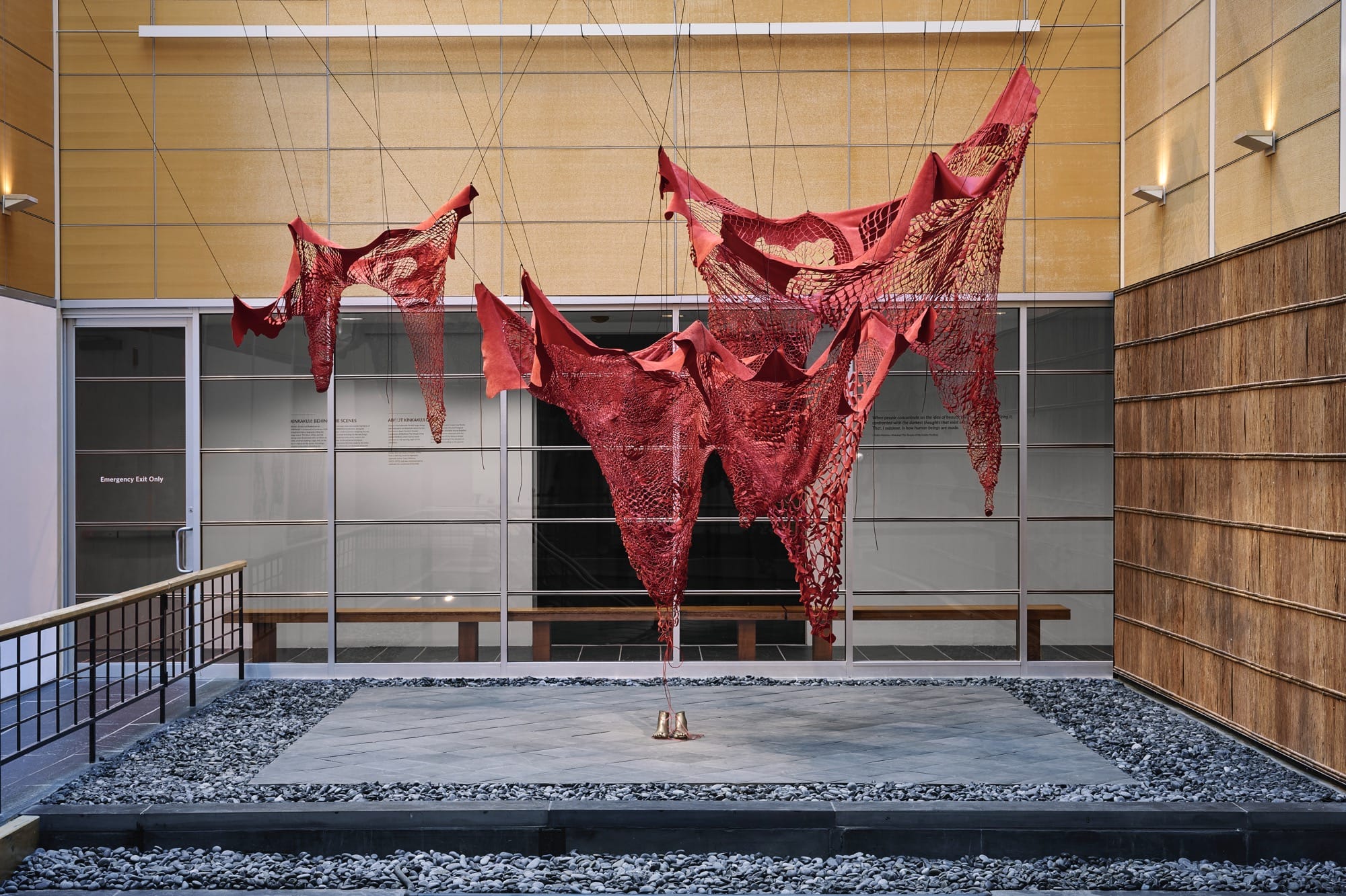
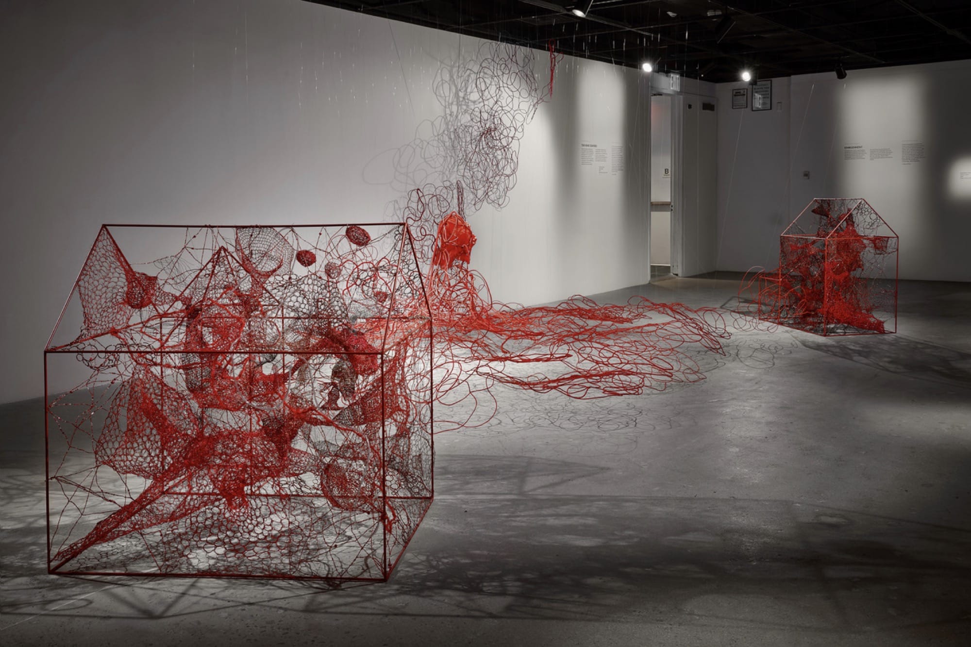
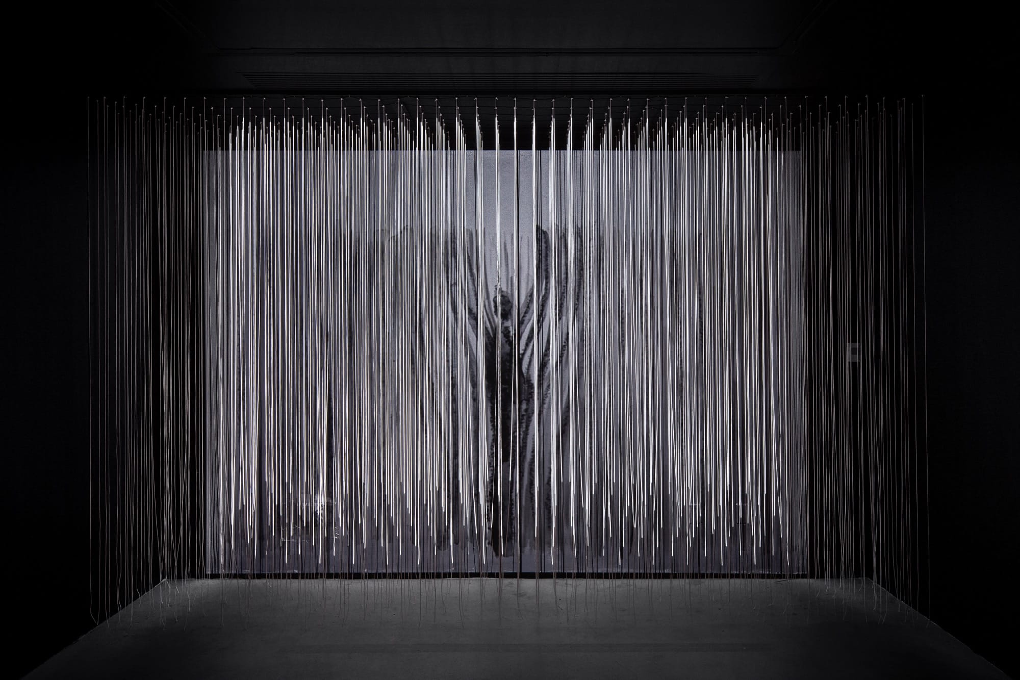
Commemorating the 80th anniversary of the end of World War II, Berlin-based artist Chiharu Shiota presents a poignant suite of large-scale works in Two Home Countries at Japan Society Gallery. That artist is known for her immersive string installations, inviting us into emotive, atmospheric experiences that tap into both universal and deeply personal narratives.
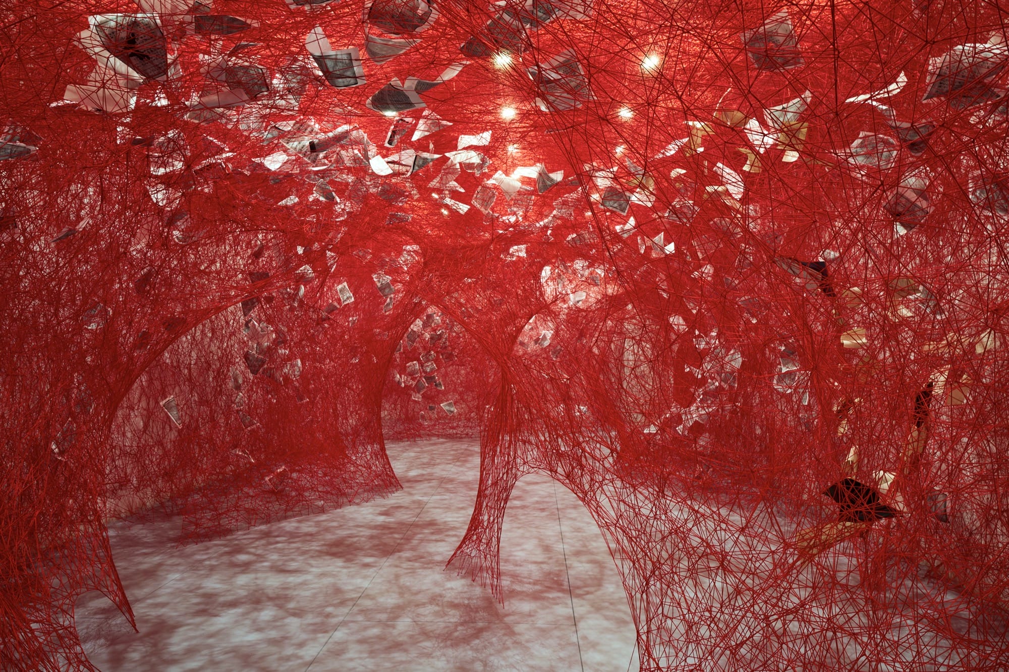
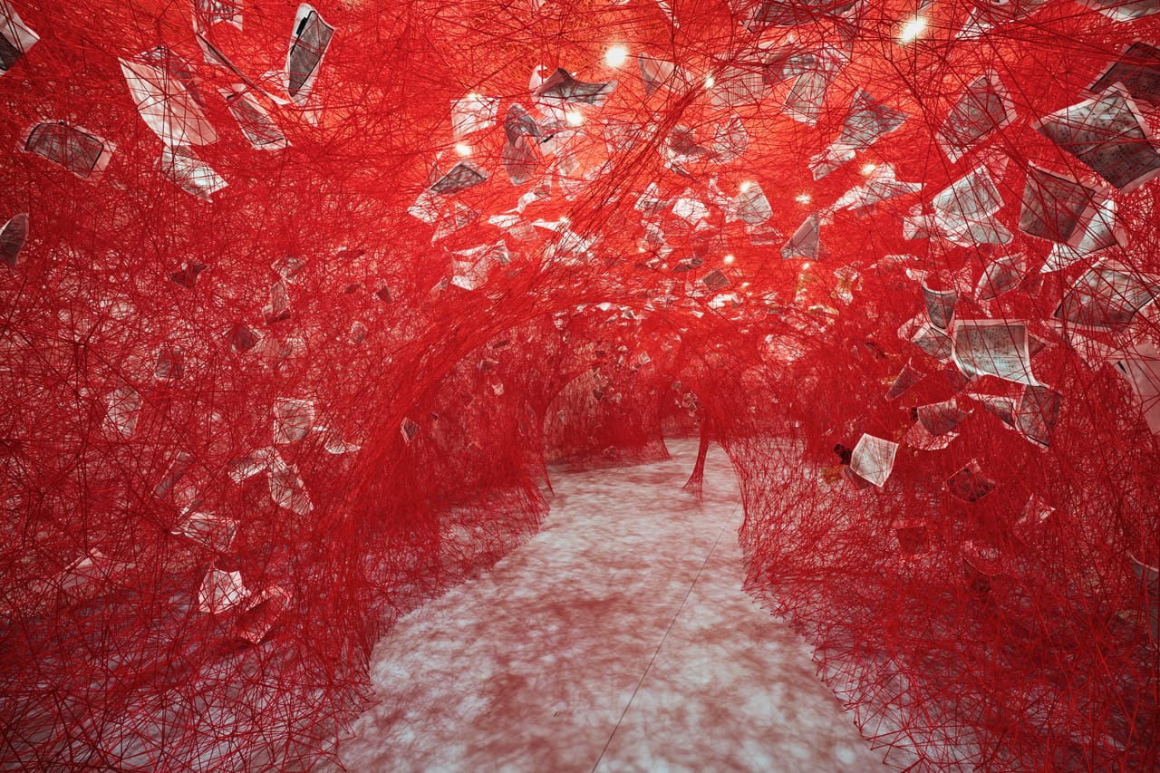
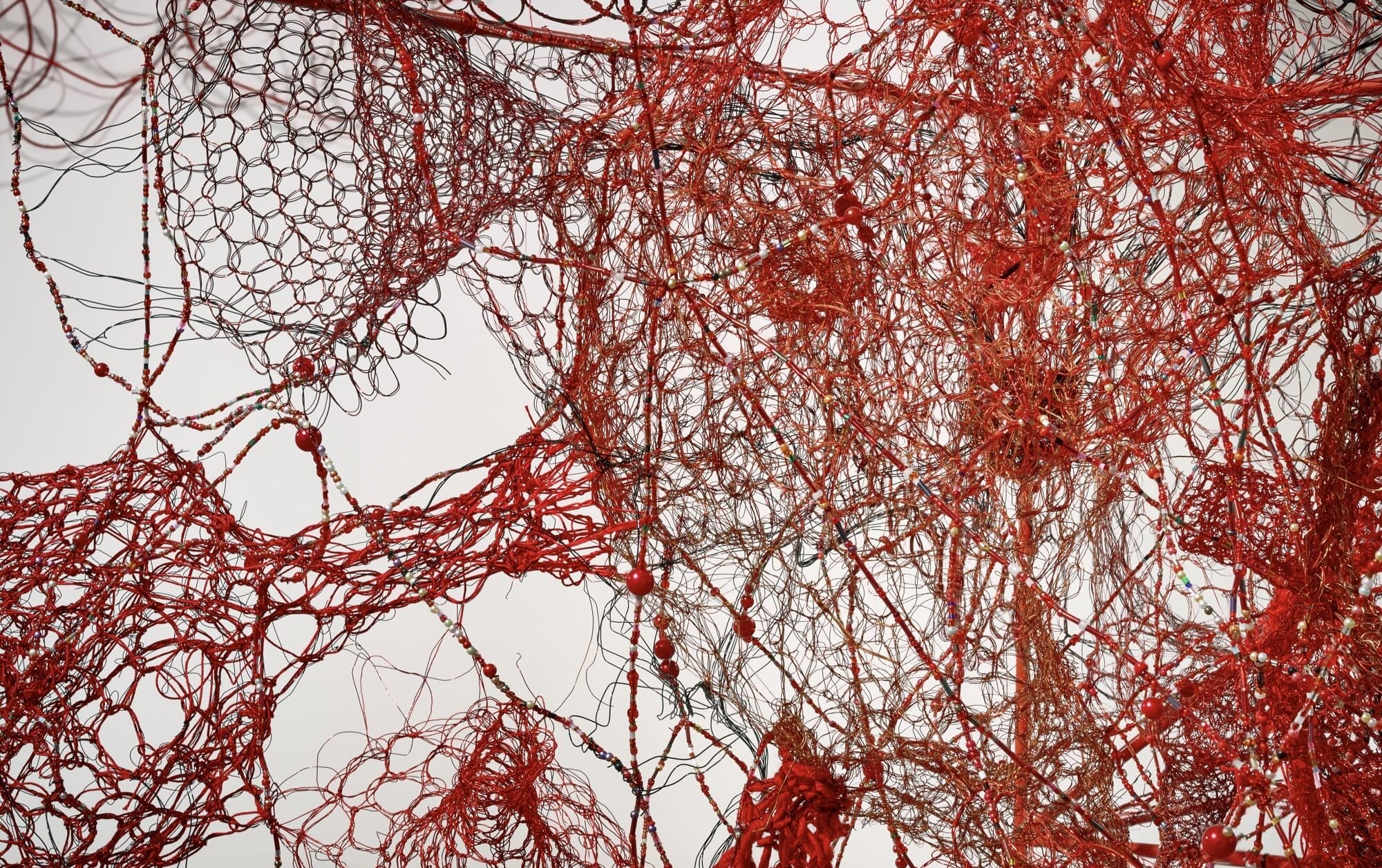
In Two Home Countries, viewers enter a vivid world shaped by red thread, redolent of intertwined veins and blood vessels that attach to the floor, take on the shapes of houses, and spread through an entire room with a cloud-like aura of red—filled with written pages. Themes of memory, mortality, connection, identity, and belonging weave through Shiota’s pieces, exploring “how pain, displacement, boundaries, and existential uncertainty shape the human condition and our understanding of self,” the gallery says.
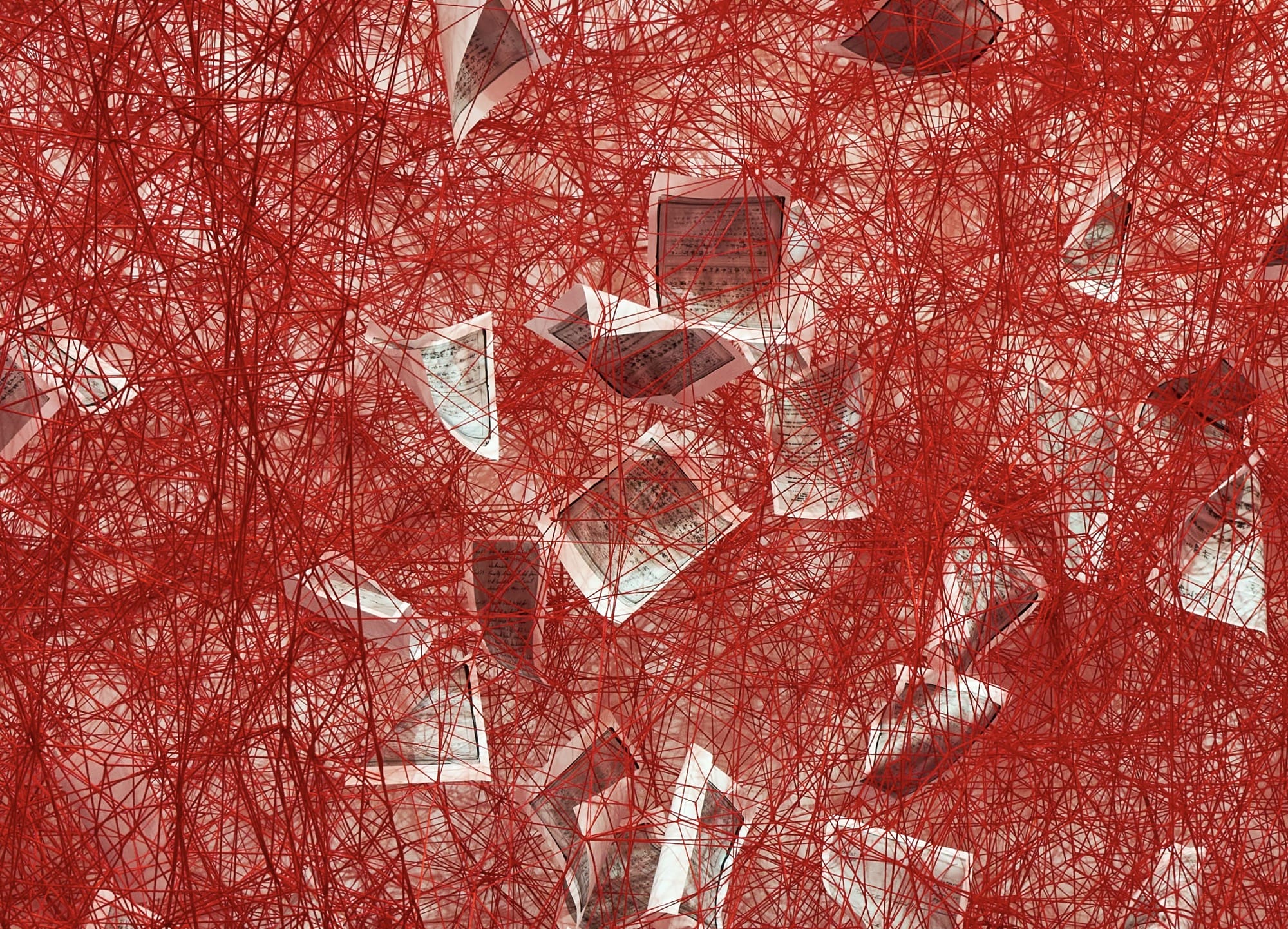
An expansive, room-sized work titled “Diary,” which is based on an earlier installation and commissioned anew for Two Home Countries, incorporates a dense web of yarn in which float pages of journals that once belonged to Japanese soldiers. Some were also penned by German civilians in the post-war era. “The accumulated pages reveal an expansive record of shared human existence across national boundaries,” the gallery says.
“When the body is gone, the objects which surrounded them remain behind,” Shiota says in a statement. “As I wander the stalls of the markets in Berlin, I find especially personal items like photographs, old passports, and personal diaries. Once, I found a diary from 1946, which was an intimate insight into the person’s life and experiences.” For Shiota, the power of these objects are revealed in how she feels the presence of writer’s “inner self.”
Two Home Countries is on view through January 11 in New York City. Plan your visit on the Japan Society’s website, and find more on Shiota’s site and Instagram.
Do stories and artists like this matter to you? Become a Colossal Member today and support independent arts publishing for as little as $7 per month. The article World War II Journal Entries Float in a Web of Blood-Red Yarn in Chiharu Shiota’s ‘Diary’ appeared first on Colossal.